Charts, Colour Palettes, and Design
2014/08/19 Leave a comment
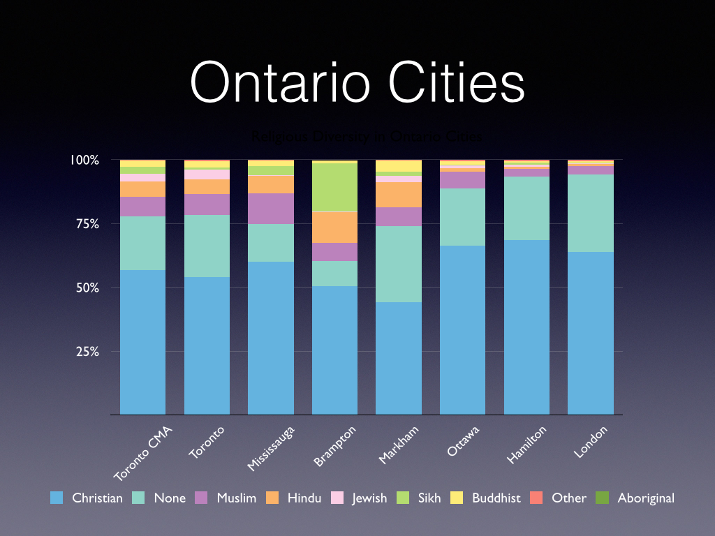
NHS 2011
As some of you may know, working fairly intensely on analyzing and charting Canadian multiculturalism as seen through the National Household Survey data from 2011 (not as reliable as the Census but what we have).
In looking at how to make charts as simple as clear and possible, came across some good design and related sites.
The above sample is illustrative of the work I am doing.
Starting with Perceptual Edge on data visualization, and the advantages of simplicity. A short clear article outlining good design principles, with some suggested colour palettes:
Practical Rules for Using Color in Charts – Perceptual Edge
For a wider choice of colour palettes, see Every ColorBrewer Scale.
And for users of iWork, this nifty and easy to follow tutorial on how to use the “Colour Picker” effectively and create customized palettes:
Using Apple’s “Color Picker” in Pages 5, Numbers 3, & Keynote 6 (iWork 2013)
Any feedback or suggestions always welcome.

