When I lived in my old D.C. neighborhood of Mount Pleasant, it was at that particular stage of gentrification where it seemed truly diverse. Taquerias and pupuserias stood right alongside indie theaters and grungy dive bars; the sidewalks were a multicultural mix of young, mostly white professionals and working-class people of color. But if you looked closer, you’d notice what some experts call “micro-level segregation.”People from different economic and racial backgrounds didn’t frequent the same bars, restaurants, and stores. Latinx residents seemed to hang out at Marleny’s, whereas more affluent newcomers would be seen at Marx Café—right next door.In a new map, MIT Media Lab visualizes that kind of micro-level segregation in the Boston metro region to show that “economic inequality isn’t just limited to neighborhoods,” as the researchers write on the website. “It’s part of the places you visit every day.”The map, which the MIT team hopes to expand to the 11 largest U.S. cities, is a part of ongoing research into how individual decisions and opportunities shape real-word urban issues so that “we can act and intervene in human behavior,” said Esteban Moro, the principal investigator at MIT Media Lab and an associate professor at Universidad Carlos III de Madrid.To create the map, Moro and his colleagues compiled aggregate location data collected by Cuebiq’s Data for Good initiative, harvested from digital devices (like cell phones and tablets) of 150,000 anonymous sources between 2016 and 2017.Based on the median income of the census block where each anonymous user spent the most time, the researchers assigned them to one of four income brackets. They also obtained a list of 30,000 places—including restaurants, bus stations, museums, offices, and coffee shops—that these users frequented most often. For each place (represented as one dot on the map), they were able to determine its share of visitors from each income category.
Based on that distribution, they placed each place on an inequality index (displayed on the top left corner): The most unequal places (in red) were those where only one type of income group visited in the time period; the most equal (in blue) were those where all four income groups had similar shares—meaning that people of diverse economic backgrounds spent time there at roughly at the same rate.
The resulting map looks a lot like a view of Boston from an airliner on final approach over the city. But the multicolored points of light are actually schools, businesses, and other meeting places.
(MIT Media Lab)The resulting “Atlas of Inequality” reveals a taxonomy of places in the city that tend to be more diverse and those that tend to be more economically homogenous. Among the most equal places, Moro and his colleagues found, are museums and airports. Schools, on the other hand, are among the least.What’s striking, although perhaps not entirely surprising, is that two places can be just meters apart and have a completely different economic profile of visitors. Where we get coffee, where we buy groceries, and where we grab take-out often reflect our choices, which determine the kinds of people we interact with every day. Or, these habits reflect our constraints—and show what places are accessible and welcoming to certain groups of people.“Right now the way we understand segregation is at the census tract level,” Moro said. “But our decisions that are impacting segregation happen actually at much smaller level—within 25 meters.”Here’s an example from Boston of two coffee shops (whose names have been anonymized by the researchers to protect the businesses) just across the street from each other, one of which is much more diverse than the other:
(MIT Media Lab)
The map and accompanying research, of course, have limitations. While Moro and his colleagues made sure that the sample of anonymous users they analyzed was as representative of the general population as it could be, it does nevertheless leave out people at the lower extreme of the income spectrum—people who are homeless, for example—who bear the brunt of segregation. The researchers also acknowledge that the list of places they feature is not comprehensive.
As soon Donald Trump took office, his administration started on his primary promise: A crackdown on undocumented immigrants.
On his command, the Department of Homeland Security (DHS) widened the dragnet—targeting, essentially, anyone without papers, even if they had not committed serious crimes. The emphasis shifted beyond the border region, with federal immigration authorities using workplace and other raids to round up undocumented immigrants. Young people who were previously exempt from deportation through Deferred Action for Childhood Arrivals (DACA) also became vulnerable, after the Trump administration announced the end of the Obama-era program.
So, what has the impact of this aggressive approach been so far? Below are three maps that provide answers. The common theme: Local sanctuary policies that limit cooperation with federal authorities seem to be blunting the force of the administration’s actions. Areas with greater local limitations on federal immigration cooperation have seen, in general, smaller increases in arrests—even if they have large immigrant populations.
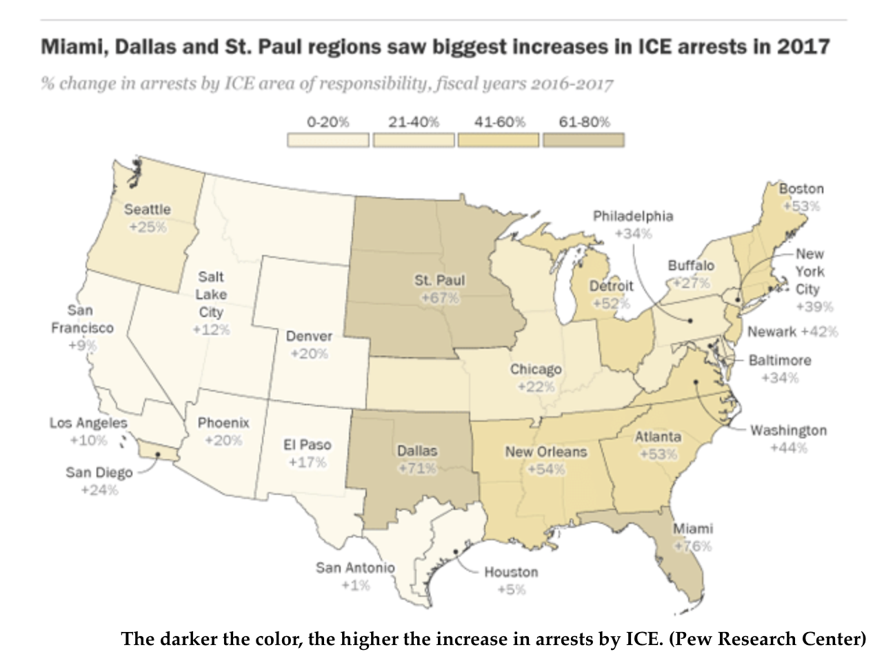
The first map comes from a recent Pew Research Center report, which analyzed the change in immigration arrests between 2016 and 2017. It finds that between January 20, when Trump took office, and September 30, when the fiscal year ended, Immigration and Customs Enforcement (ICE) arrests went up by 42 percent compared to the same period in 2016. The total arrests in 2017 were also 30 percent higher than the previous year.
While these numbers represent significant increases from recent years, they are not nearly as high as in 2009, when twice as many people were arrested. That initial high number in Barack Obama’s first year in office declined over the duration of his presidency, after he shifted policy to focus on deporting particular categories of undocumented immigrants. It’s also important to note that while the Trump administration is arresting more people, it has not yet been able to deport them at Obama-era levels because of immigration court backlog.
Pew’s report breaks down 2017’s increases in arrests by geography, showing where ICE has been most effective. The agency operates out of field offices in some major cities that cover not just that particular city, but wider “areas of responsibility” that sometimes span multiple states. All of these areas saw increases in arrests in 2017, but the Miami field office, which covers all of Florida, saw the most—a striking 76 percent increase compared to 2016. Dallas and St. Paul were next on the list, with 71 and 61 percent increases, respectively. (Dallas had the highest absolute number of arrests of all field offices.) New Orleans, Atlanta, Boston, and Detroit followed with more than 50 percent increases.
Here’s Pew’s map that colors the areas of responsibility based on the increase in arrests between 2016 and 2017:
The darker the color, the higher the increase in arrests by ICE. (Pew Research Center)
While the concentration of undocumented immigrants certainly drives arrest numbers, it doesn’t completely explain why some areas have had much higher jumps in arrests than others. If it did, immigrant-rich areas near the border, like El Paso and Phoenix, and traditional immigration hubs like New York and Los Angeles, would have all seen much higher increases.
What this map suggests is that local policies matter.
Take Miami, for example. The city renounced its sanctuary city statusafter the Trump administration threatened to withdraw federal funding. (Courts have since blocked that threat.) Attorney General Jeff Sessions praised that decision in a visit last year. Via USA Today:
“We cannot continue giving taxpayer money to cities that actively undermine the safety and efficacy of federal law enforcement efforts,” Sessions said during the appearance at PortMiami. “So to all sanctuary jurisdictions across the country, I say: Miami-Dade is doing it, other cities are doing it, and so can you.”
Miami’s decision to get local law enforcement involved likely helped boost arrests in and around that area, which already has a high concentration of immigrants.
The Atlanta metro area has also seen high increases in 2017 for the same reason. Despite former Mayor Kasim Reed’s defense of sanctuary cities, Georgia state law requires cooperation with ICE—and some of the counties around Atlanta have been quite eager to help. The state also has high penalties for driving without a license, which make it more likely for folks without papers to enter the criminal justice system, and then, the deportation pipeline.There is at least some indication that the Trump administration is trying to have the opposite effect, instead targeting those jurisdictions that have more protective local laws. In September 2017, ICE, focused their raids in localities and cities that have sanctuary policies, saying that the agency was “forced to dedicate more resources to conduct at-large arrests in these communities,” because of these policies. Later, ICE’s director also suggested that the politicians from these cities should face criminal charges for harboring undocumented immigrants. But so far, the effect of that laser focus is unclear—it’s certainly not visible in the aggregate data used for the Pew map.
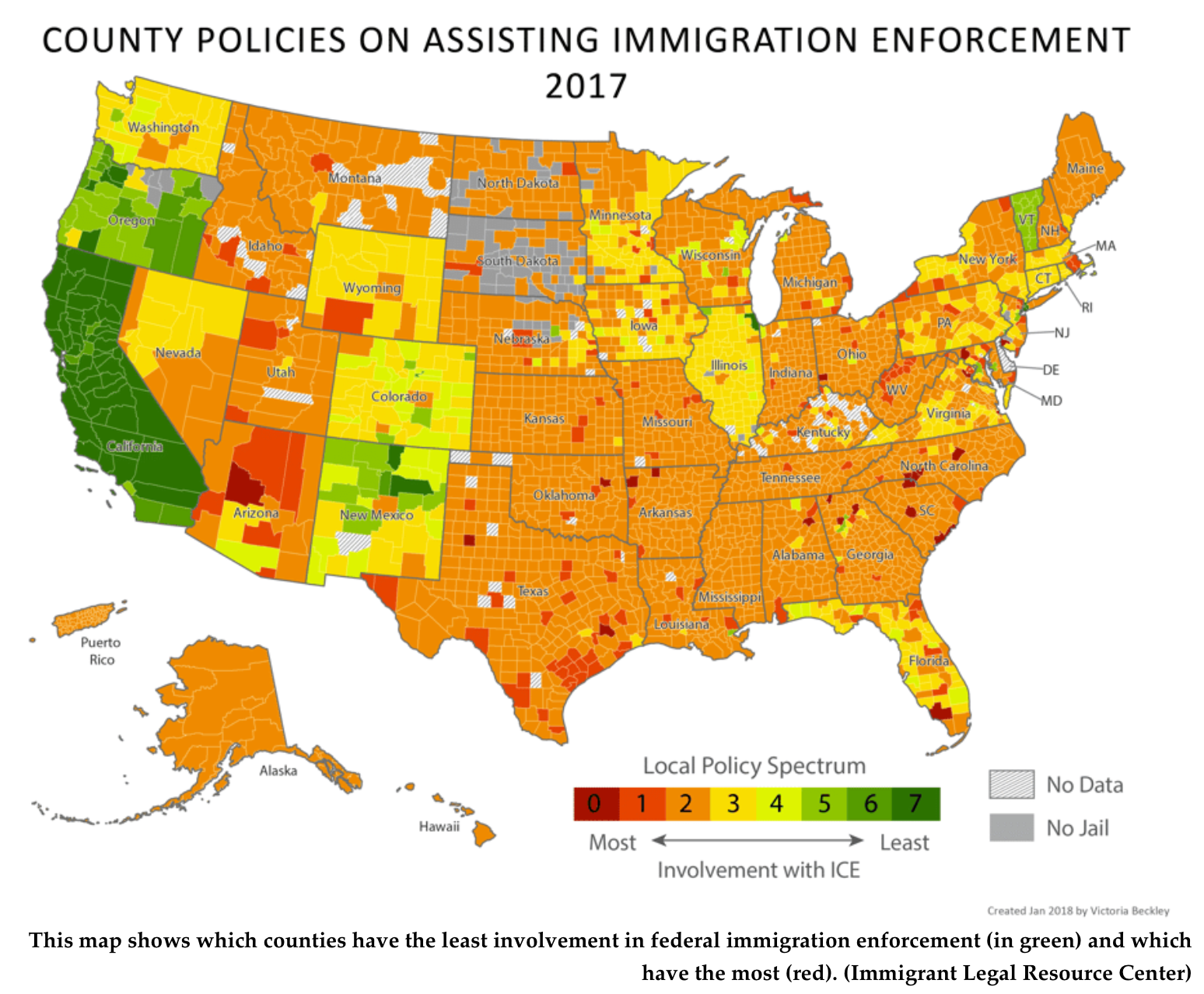
Local politics have also shifted in the last year, in response to the national immigration agenda. The second and third maps show the current county-level sanctuary policies—and how they have changed since Trump took office. Both come from a new report by the Immigrant Legal Resource Center (ILRC), an immigrants’ rights organization that has been tracking how involved localities have been in immigration enforcement.
The below map shows the strength of the sanctuary policies in 2017. The places in green are most protective of local immigrant populations—they disentangle policing from federal enforcement. In red are the places that provide the most assistance to federal efforts:This map shows which counties have the least involvement in federal immigration enforcement (in green) and which have the most (red). (Immigrant Legal Resource Center)ILRC legal researchers created these rankings based on a seven-point rubric that reflects the spectrum of existing sanctuary policies in 3,000-plus counties. They included policies that limit the use of municipal resources for immigration enforcement, that forbid police from collecting information about immigration status, that ask police to decline ICE’s warrantless requests to detain individuals for extra time, and others. They also looked at whether these localities had agreements with ICE (called 287(g) agreements) to deputize their police officers to do various immigration enforcement duties.ILRC also traced the changes in these policies. And what they noticed was that as the Trump administration doubled down on curbing illegal immigration, some local governments started joining the effort, while others started mounting resistance. According to ILRC’s analysis, 410 localities strengthened sanctuary policies in 2017 (in blue below). Many did so in more than one way. Denver County, Colorado, for example, enacted a law in 2017 that forbids city funds or resources going towards investigation or detention of undocumented immigrants—in the absence of a judicial warrant. It also rules out 287(g) contracts. A quarter of the counties have now put limits on how their police respond to ICE’s “detainer” requests, up from just a handful in 2013. These demands to detain individuals that the federal agency suspects are undocumented for longer than their sentence have been ruled illegal by severalcourts.
Fewer counties went the other way, the report notes (warm colors below). Only around 244 devoted more resources to helping out ICE in 2017. (Note: Local governments with 287(g) agreements have been increasing in the last two years, but in some cases, this move may have been balanced in some other way—by a stop in responding to detainer requests in fear of lawsuits. So counties that entered into new 287(g) agreements on this map below could appear as any color, depending on how weak or strong their original policies were in totality.)
Overall, though, around 74 percent of the counties continue to help ICE out in whatever way it asks, “often without even analyzing whether it is legal to do so,” the report notes.
“There is a great opportunity in 2018 to strengthen and establish new policies that actively protect our immigrant neighbors,” said LenaGraber, staff attorney at the Immigrant Legal Resource Center, in a statement. “And to not spend local resources detaining and deporting our community members.”