This visualization shows US immigration between 1790 and 2016.Courtesy of Pedro Cruz, Northeastern University
Researchers at Northeastern University have visualized America’s immigration history as a tree trunk, with rings that delineate the waves and patterns in migration.
The colors represent groups of immigrants from different regions: Europe is green, Latin America is orange, Africa is red, Asia is pink, the Middle East is purple, and Oceania and Canada are blue.
In an animated version, the metaphorical tree trunk can be seen growing and evolving as the years tick by.
After more than 200 years of immigration, America’s population has evolved into a vast mosaic of nearly 330 million residents, whose ancestors hail from every corner of the world.
For researchers at Northeastern University, visualizing the nearly unfathomable magnitude and intricacy of the issue was a challenge that could only be symbolized by a living organism: the rings of a growing tree.
In a simulated dendrochronology, also known as the scientific method of dating tree rings, data visualization professor Pedro Cruz and journalism professor John Wihbey used the metaphor of tree growth to map out the country’s history of immigration using census data.
“The nation, the tree, is hundreds of years old, and its cells are made out of immigrants,” the researchers wrote. “As time passes, the cells are deposited in decennial rings that capture waves of immigration.
Those patterns and trends within America’s immigration history are clear from the colors and shapes of the rings — in the 1800s, immigrants almost exclusively came from Europe, represented on the tree by green dots.
Throughout the 20th Century, as more migrants came from Latin America, the tree rings skew southward and change to yellow dots to visualize the evolution. In more recent years, as Asian immigration has skyrocketed, the rings shift westward and the dots turn pink.
See an animation showing the last two centuries, showing the tree rings growing and evolving as the years tick by:
Great data visualization and Canadian version would be comparable, although the post 1960s mix would be somewhat different:
It’s easy now to assume that Mexico has always been among the main sources of immigration to America. But as this wonderful chart by Natalia Bronshtein shows, that’s not even close to true.
(Natalia Bronshtein)
Bronshtein pulled 200 years of government data to put together the visualization. There’s an interactive version on her website: you can hover over any color, at any point, and see the exact number of immigrants who became residents from that country in that decade.
But taken as a whole, the chart tells a very clear story: there are two laws that totally transformed immigration to the United States.
The first, the National Origins Act of 1924 (a capstone on a series of anti-immigration bills passed in the few years before that), set very strict quotas on immigration to America from any country — and especially strict quotas on any country that wasn’t in western or northern Europe. (Immigration from Asia was, for the most part, simply banned.) That’s the bottleneck you see in the graph.
The second, the 1965 Immigration and Naturalization Act, demolished the old quota system. But instead of just turning the clock back to the dawn of the 20th century, the 1965 law created a completely different era of immigration to the US from all over the world — and especially from Latin America and Asia. None of the colors that are dominant on this chart up until the 1920s are dominant from the 1970s onward. Once large-scale immigration to the US was restored, the face of it looked totally different.
As some of you may know, working fairly intensely on analyzing and charting Canadian multiculturalism as seen through the National Household Survey data from 2011 (not as reliable as the Census but what we have).
In looking at how to make charts as simple as clear and possible, came across some good design and related sites.
The above sample is illustrative of the work I am doing.
Starting with Perceptual Edge on data visualization, and the advantages of simplicity. A short clear article outlining good design principles, with some suggested colour palettes:
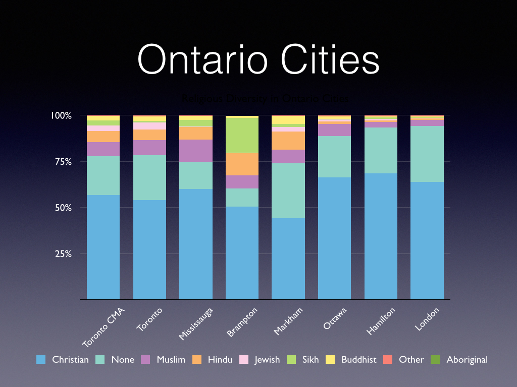
For data visualization geeks, as well as those more broadly interested in social networks and how they reinforce our existing views, this article by Gilad Lotan is a must read (Haaretz, the left-wing Israeli newspaper, draws the most from both sides):
Facebook’s trending pages aggregate content that are heavily shared “trending” across the platform. If you’re already logged into Facebook, you’ll see a personalized view of the trend, highlighting your friends and their views on the trend. Give it a try.
Now open a separate browser window in incognito mode Chrome: File->New Incognito Window and navigate to the same page. Since the browser has no idea who you are on Facebook, you’ll get the raw, unpersonalized feed.
How are the two different?
Personalizing Propaganda
If you’re rooting for Israel, you might have seen videos of rocket launches by Hamas adjacent to Shifa Hospital. Alternatively, if you’re pro-Palestinian, you might have seen the following report on an alleged IDF sniper who admitted on Instagram to murdering 13 Gazan children. Israelis and their proponents are likely to see IDF videos such as this one detailing arms and tunnels found within mosques passed around in their social media feeds, while Palestinian groups are likely to pass around images displaying the sheer destruction caused by IDF forces to Gazan mosques. One side sees videos of rockets intercepted in the Tel-Aviv skies, and other sees the lethal aftermath of a missile attack on a Gazan neighborhood.
The better we get at modeling user preferences, the more accurately we construct recommendation engines that fully capture user attention. In a way, we are building personalized propaganda engines that feed users content which makes them feel good and throws away the uncomfortable bits.
Worth reflecting upon. I try to have a range of news and twitter feeds to reduce the risk.