#COVID-19: Comparing provinces with other countries 9 March Update; New Zealand changes its tack on surging COVID-19 cases
2022/03/10 Leave a comment
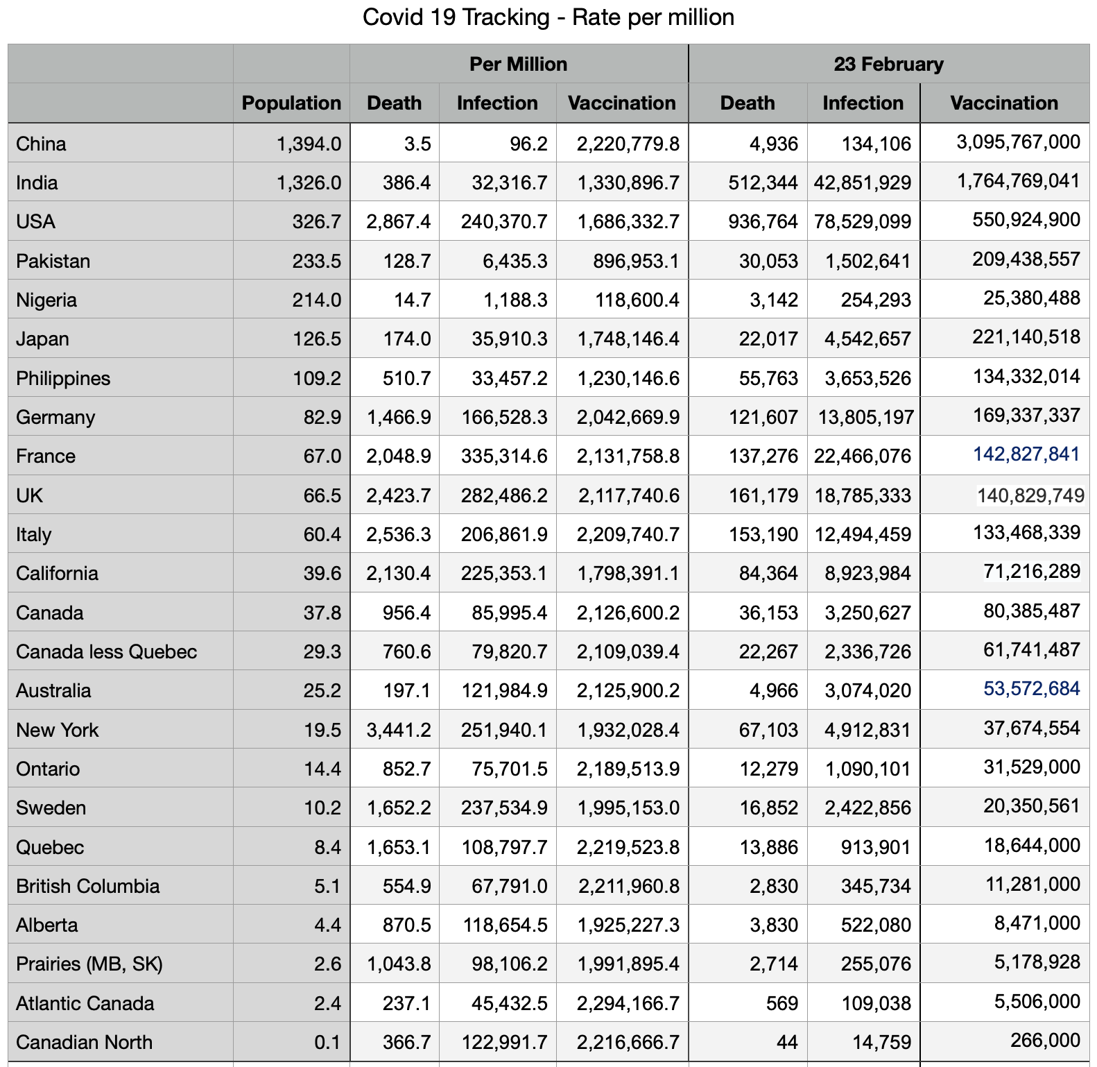
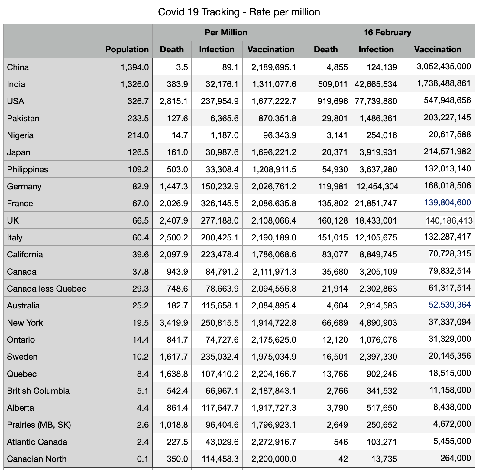
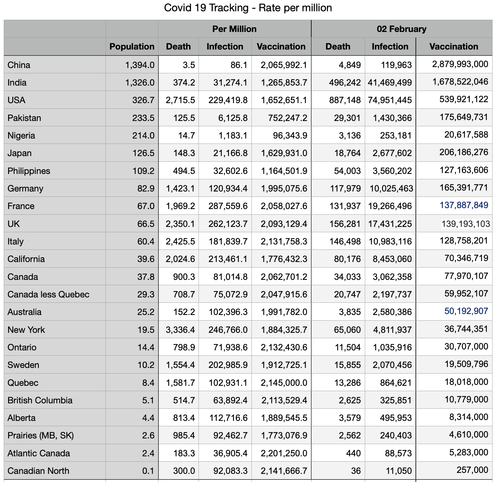
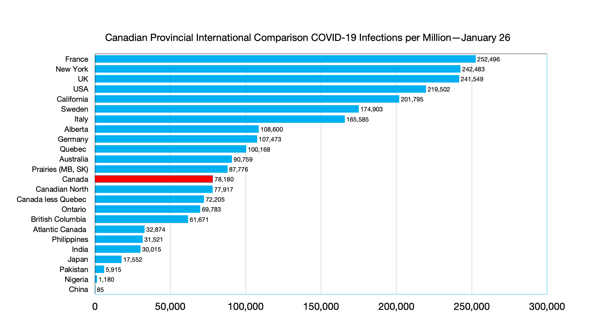
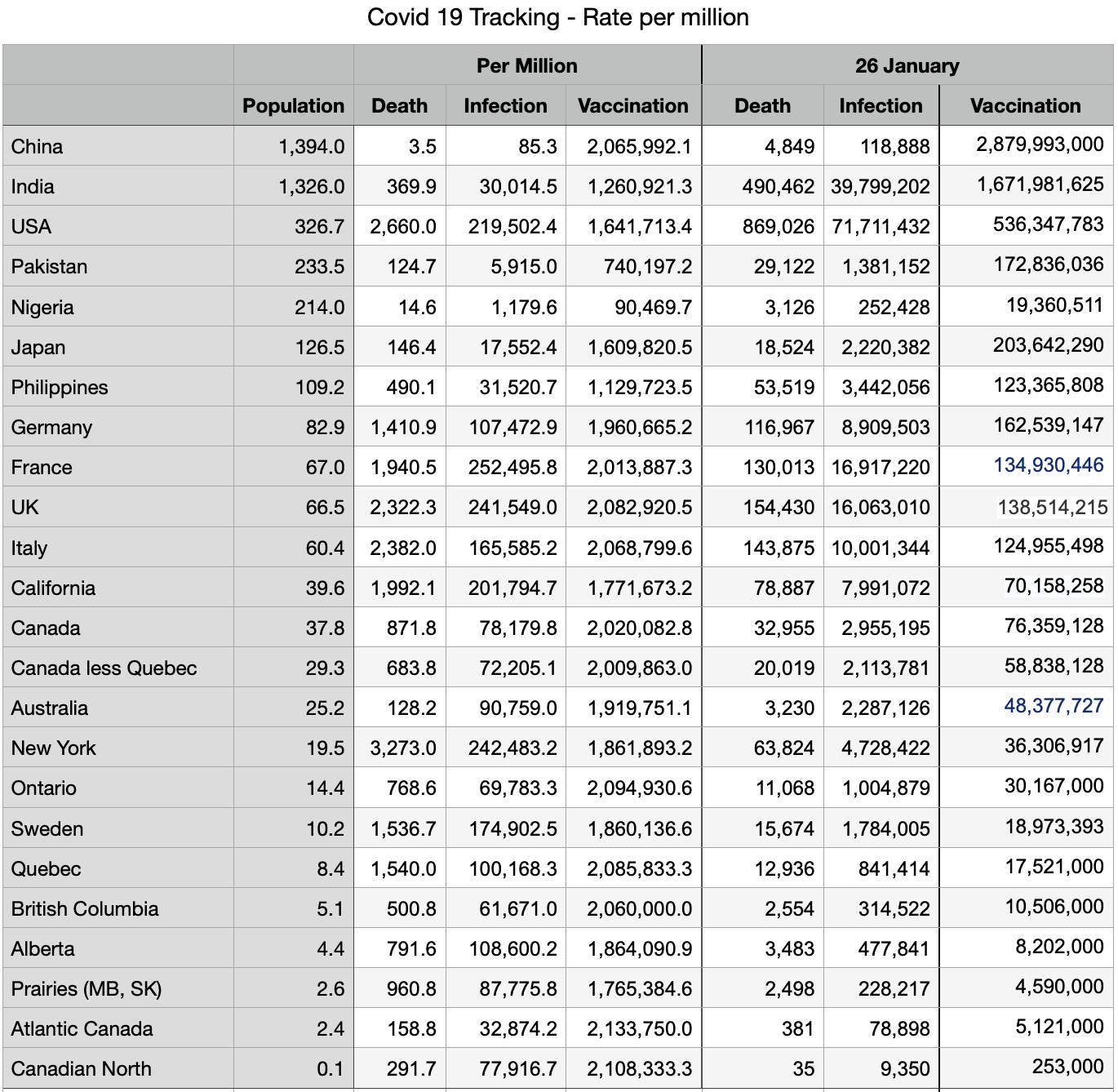
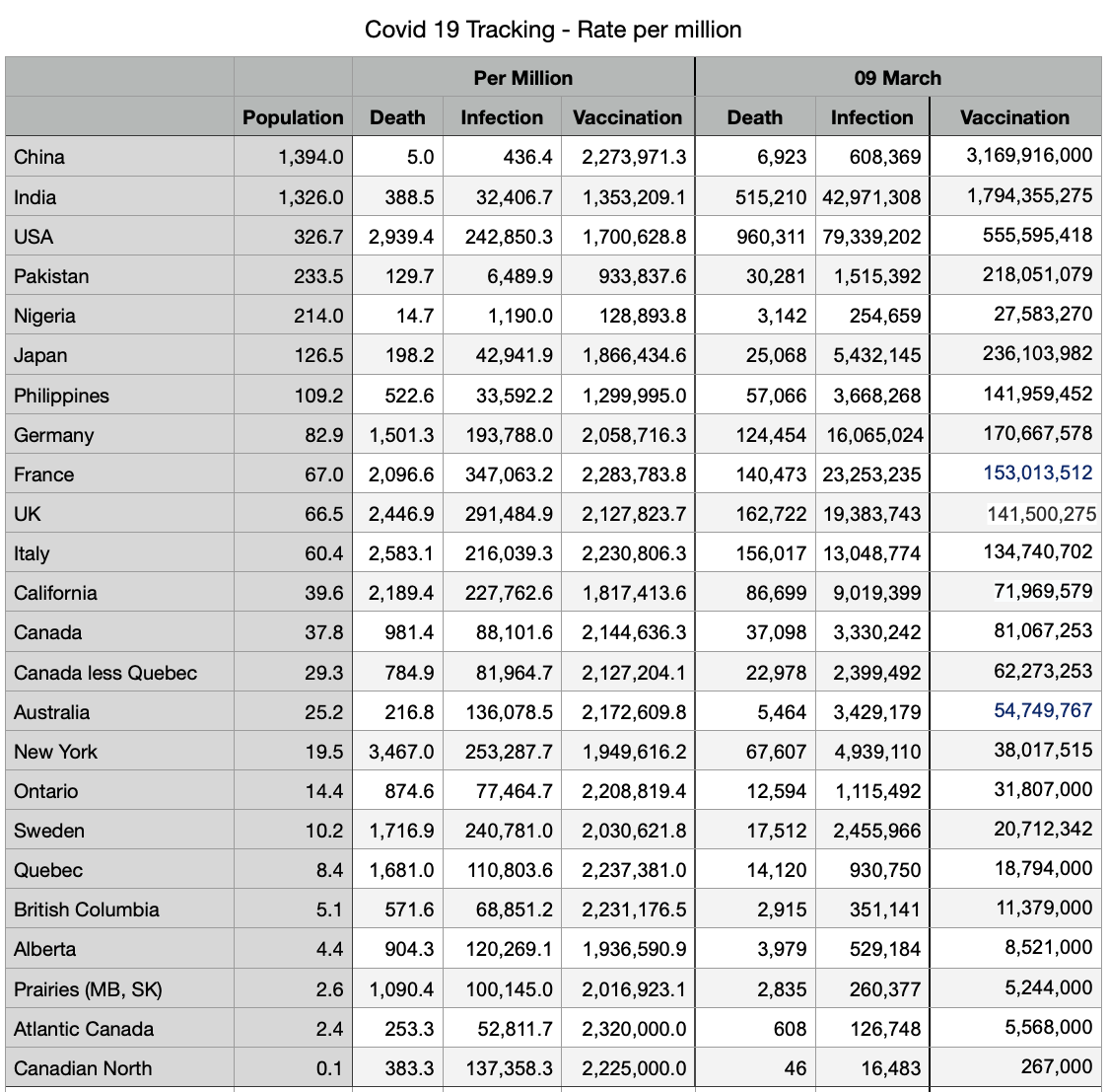
Overall decline in infections and deaths continues. Numbers from China have a further significant increase since last week, from 315,000 to 608,000 infections and from 5,380 to 6,923 deaths.
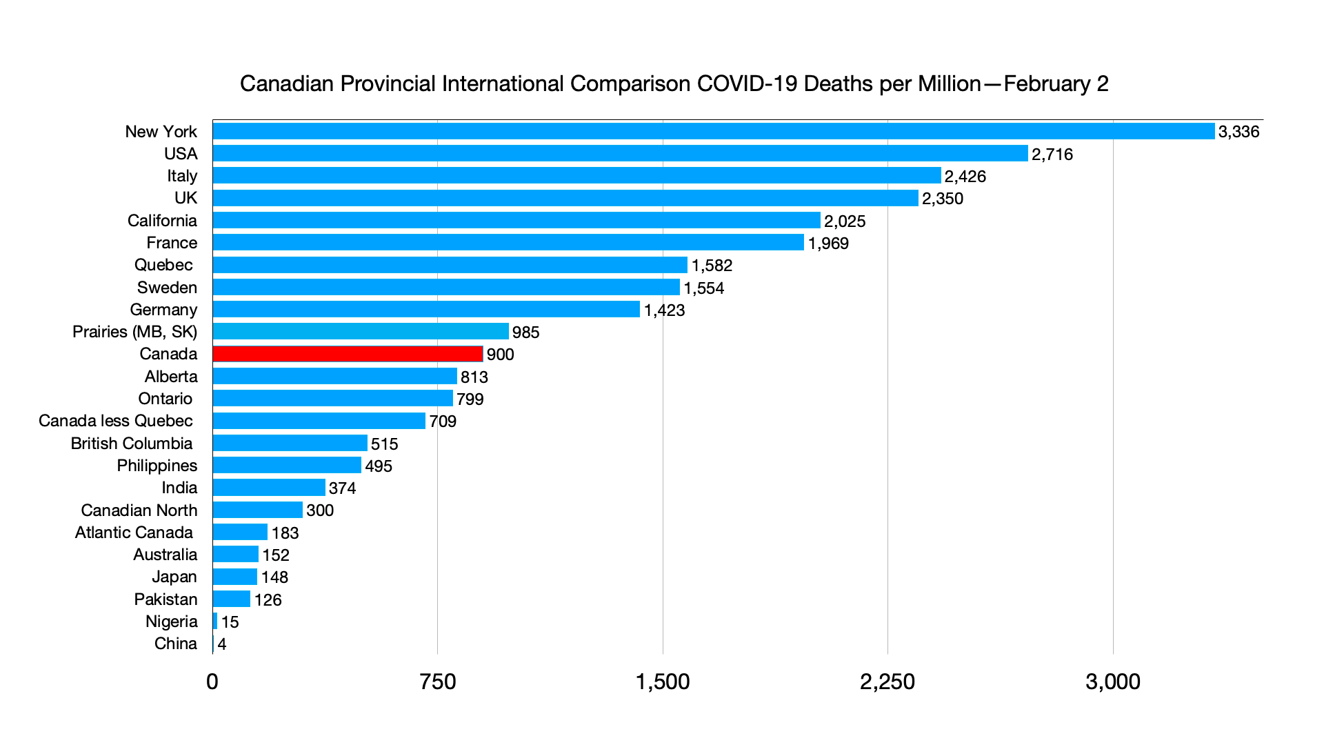
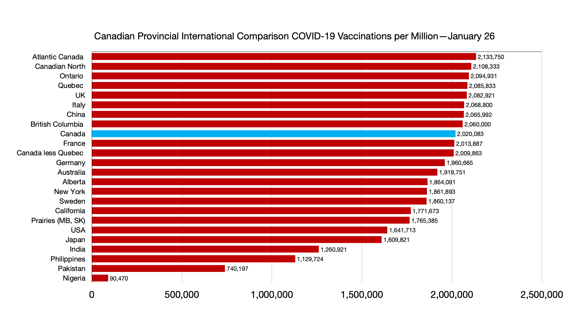
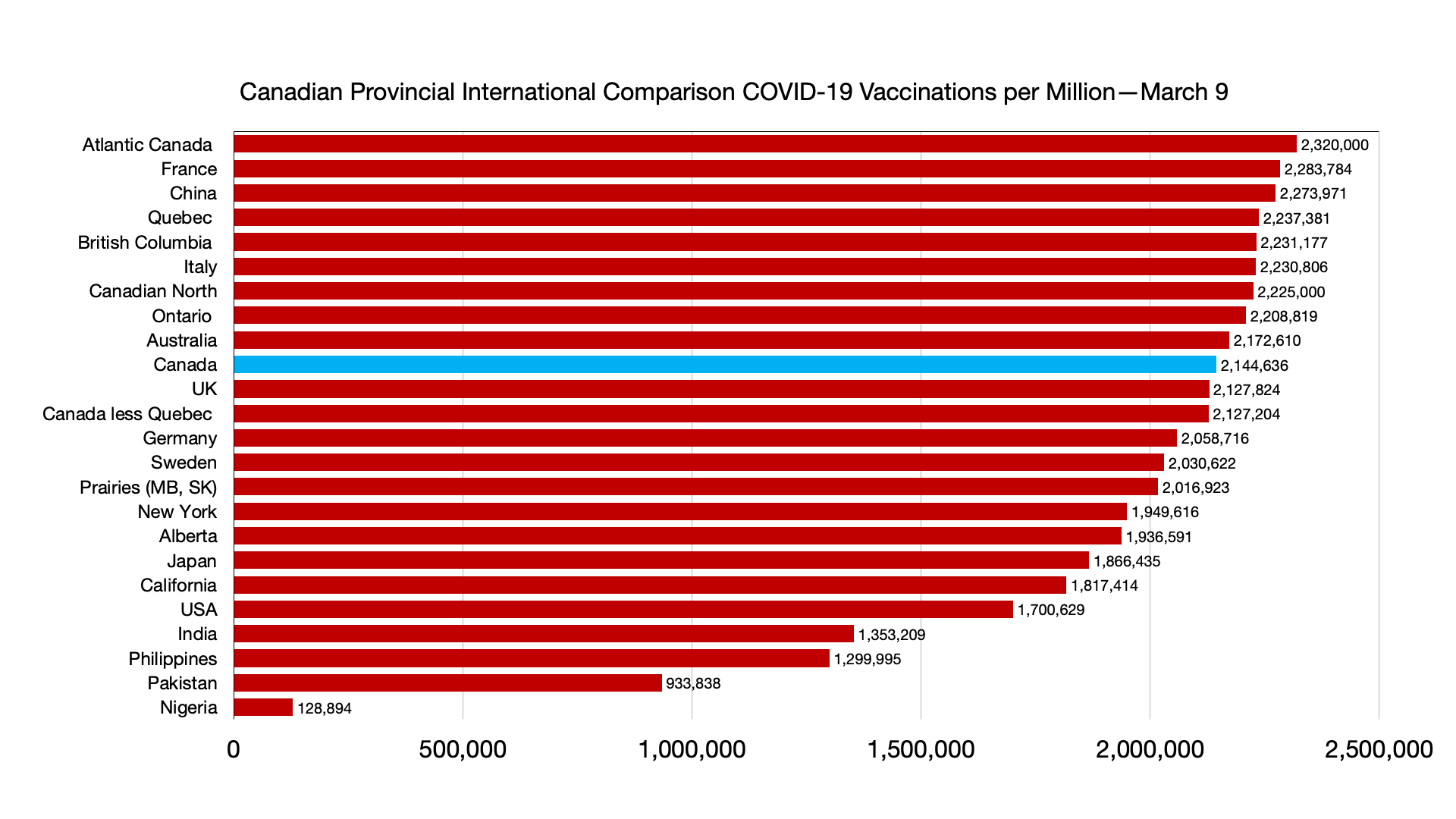
Vaccinations: Some minor shifts but convergence among provinces and countries. Canadians fully vaccinated 82.4 percent, compared to Japan 79.5 percent, UK 73.5 percent and USA 65.9 percent.
Immigration source countries are also converging: China fully vaccinated 88.3 percent (numbers have not budged over past four weeks), India 58.9 percent, Nigeria 4.2 percent, Pakistan 46.6 percent, Philippines 58.4 percent.
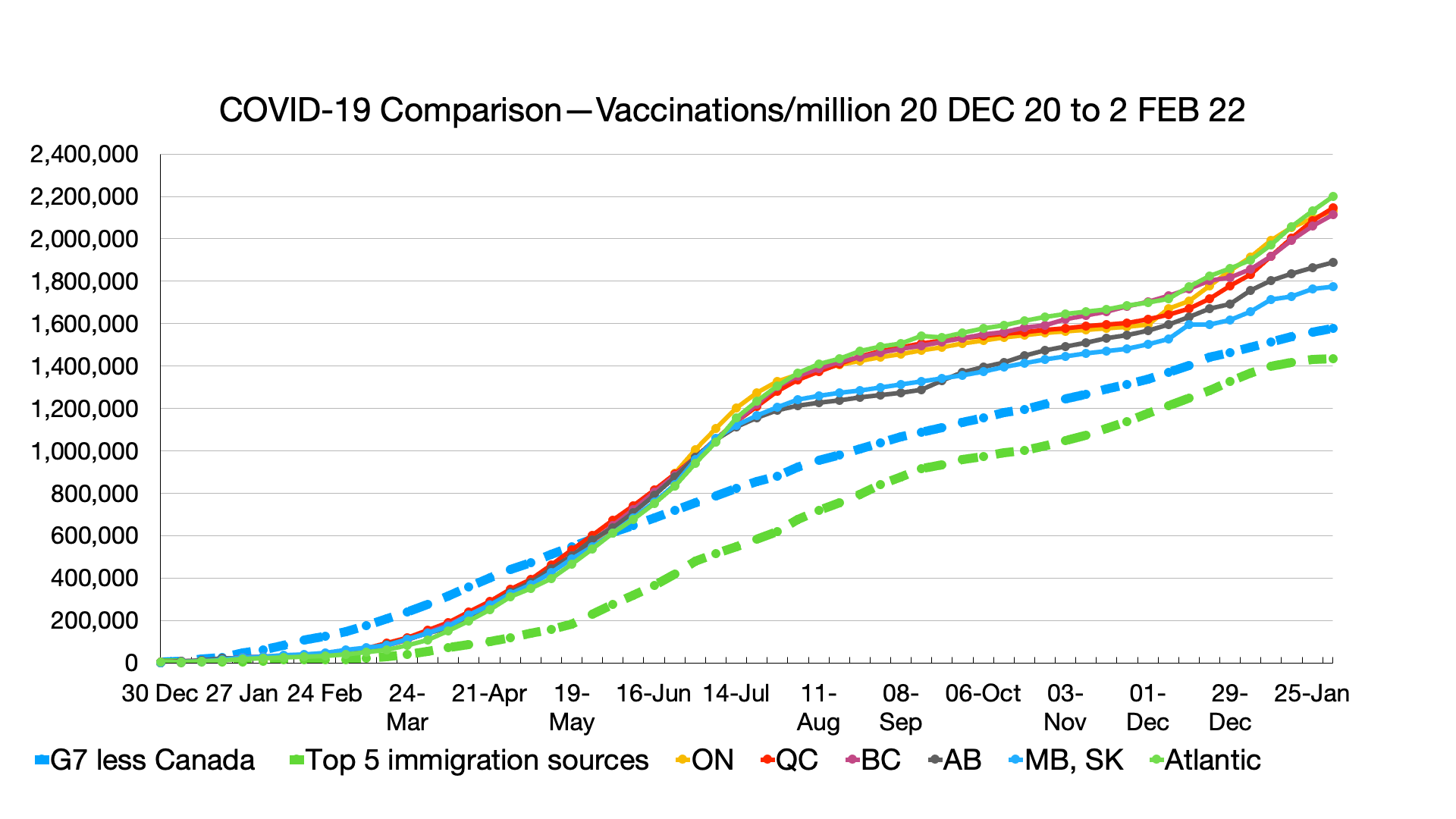
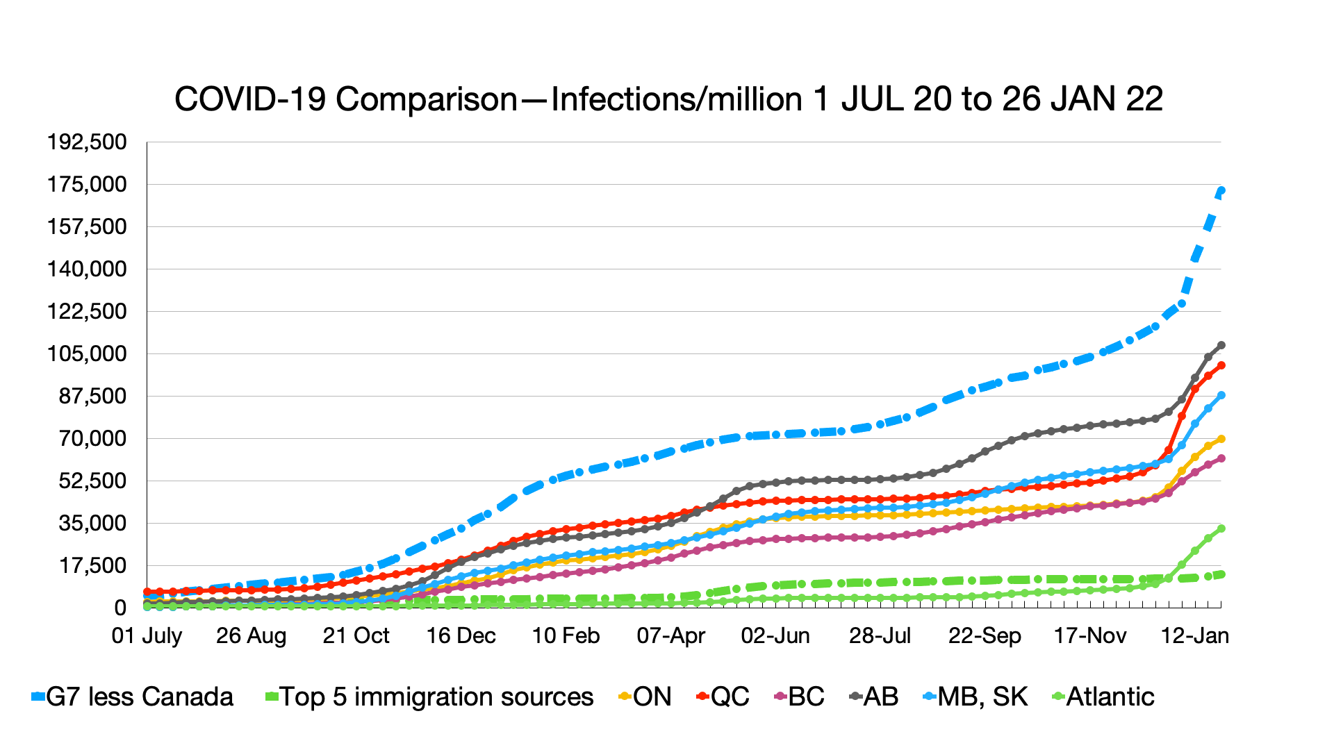
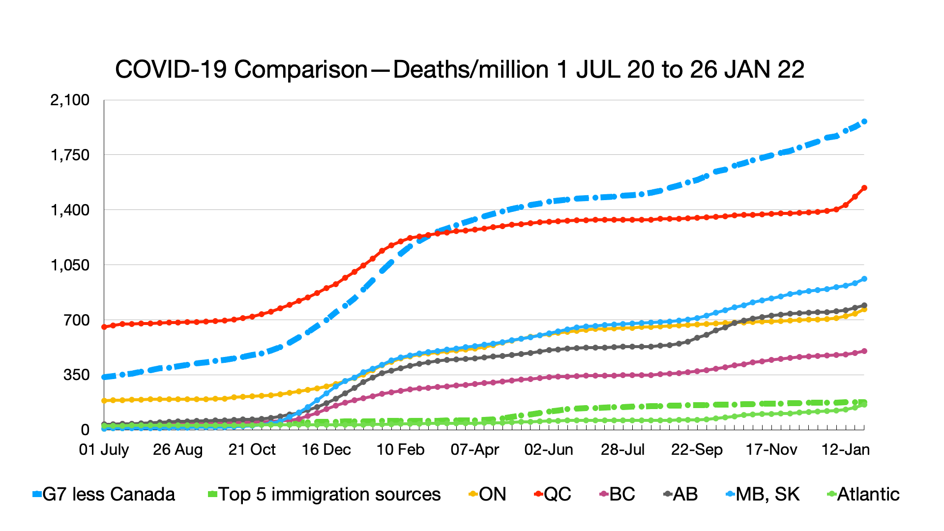
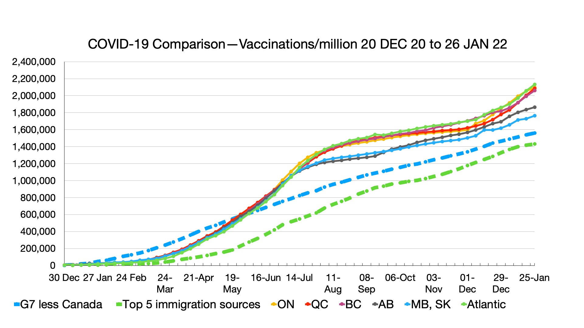
Trendline Charts:
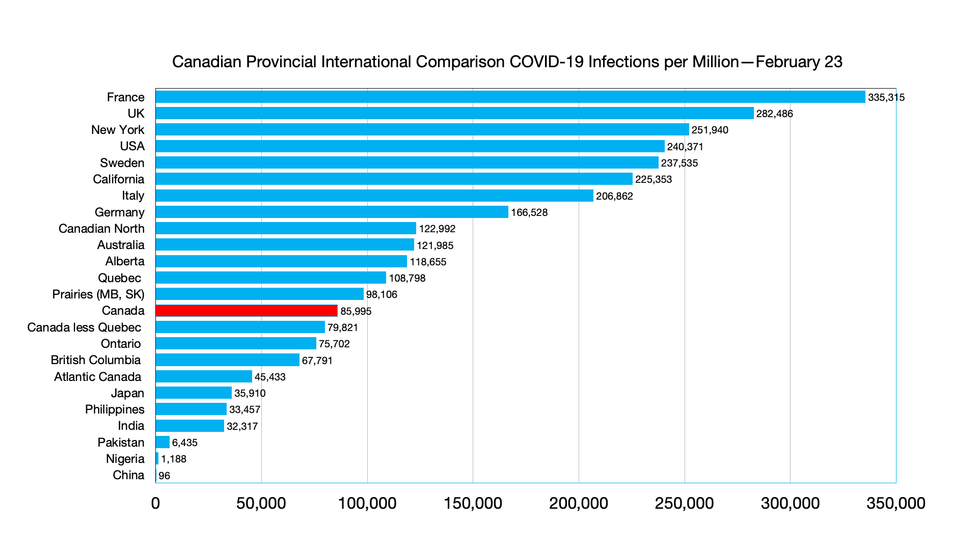
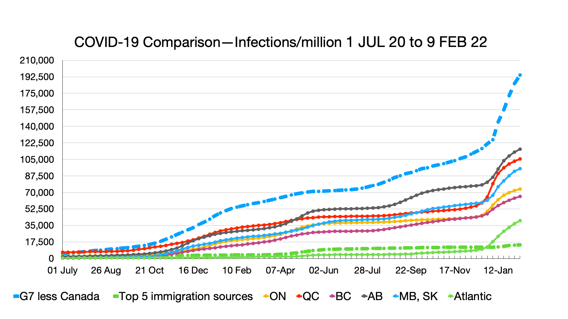
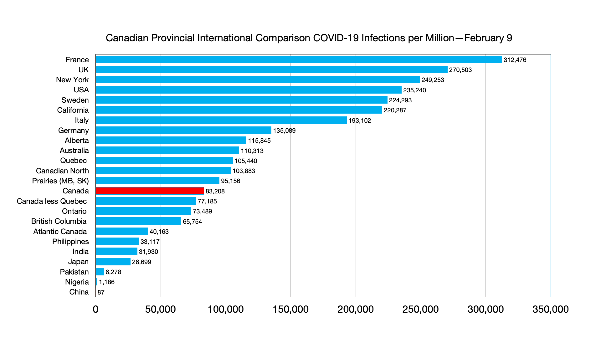
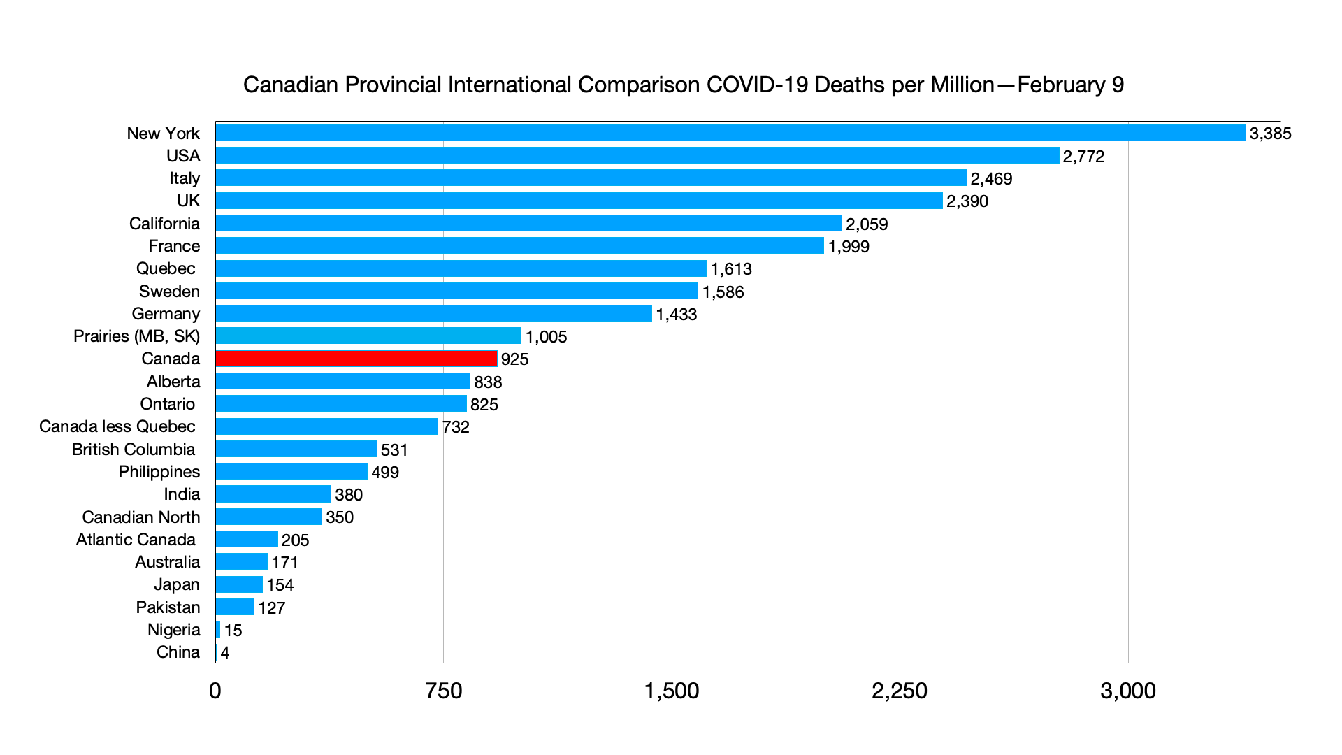
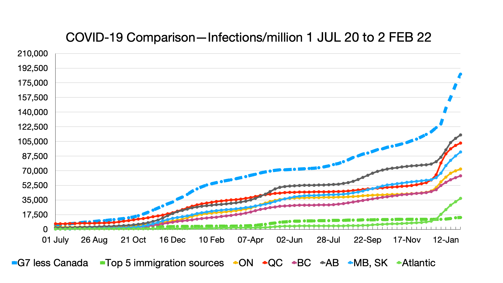
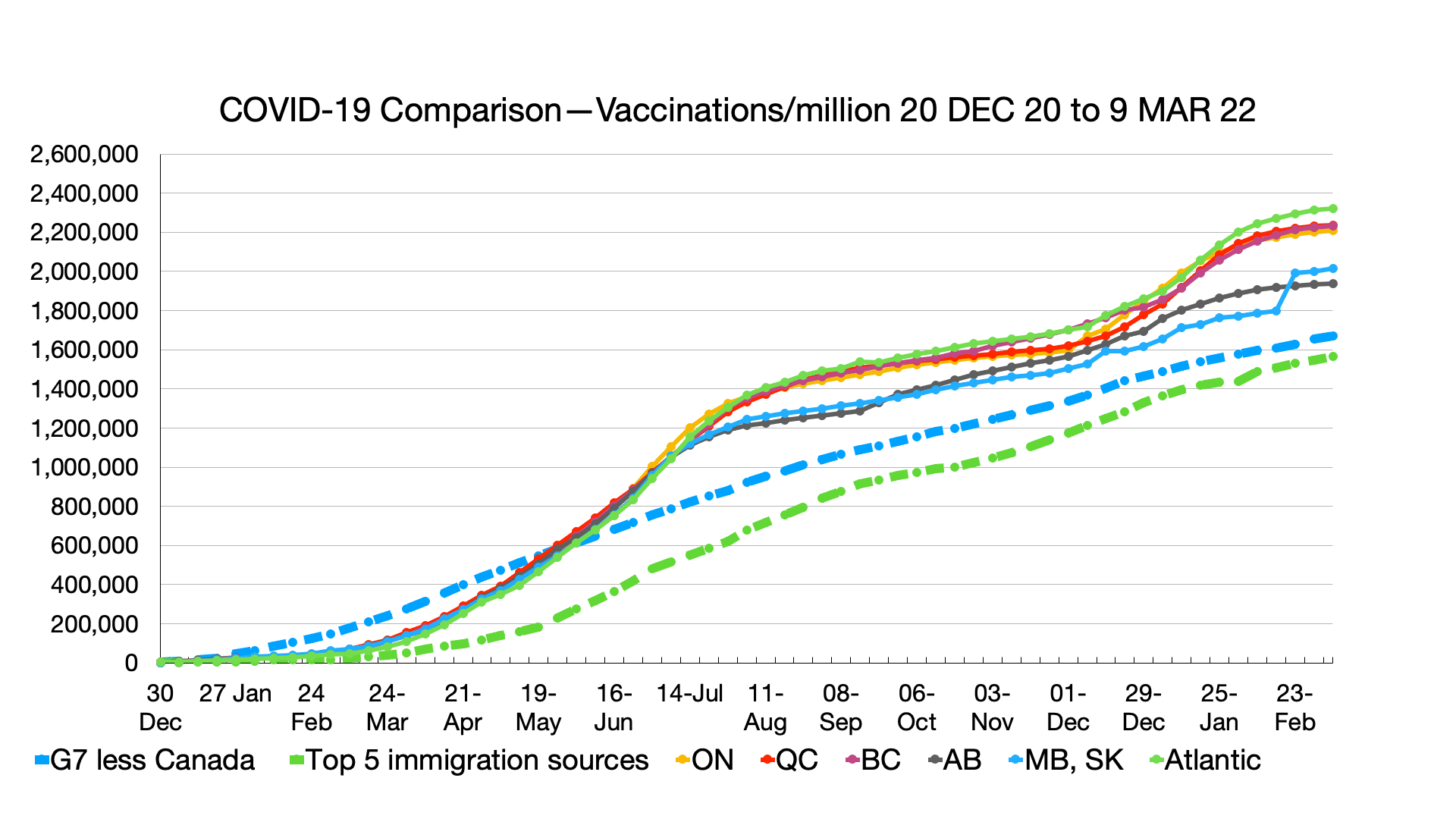
Infections: Ongoing signs of omicron and other variants plateauing, more so in Canadian provinces than comparator groups.

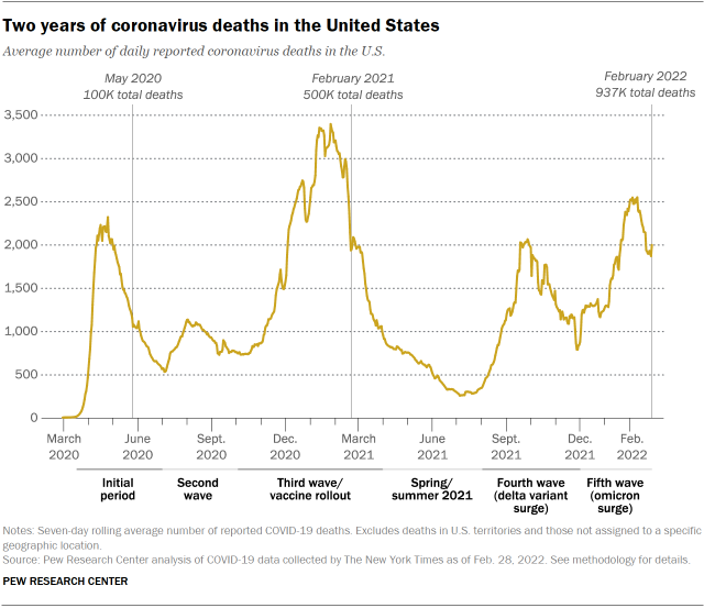
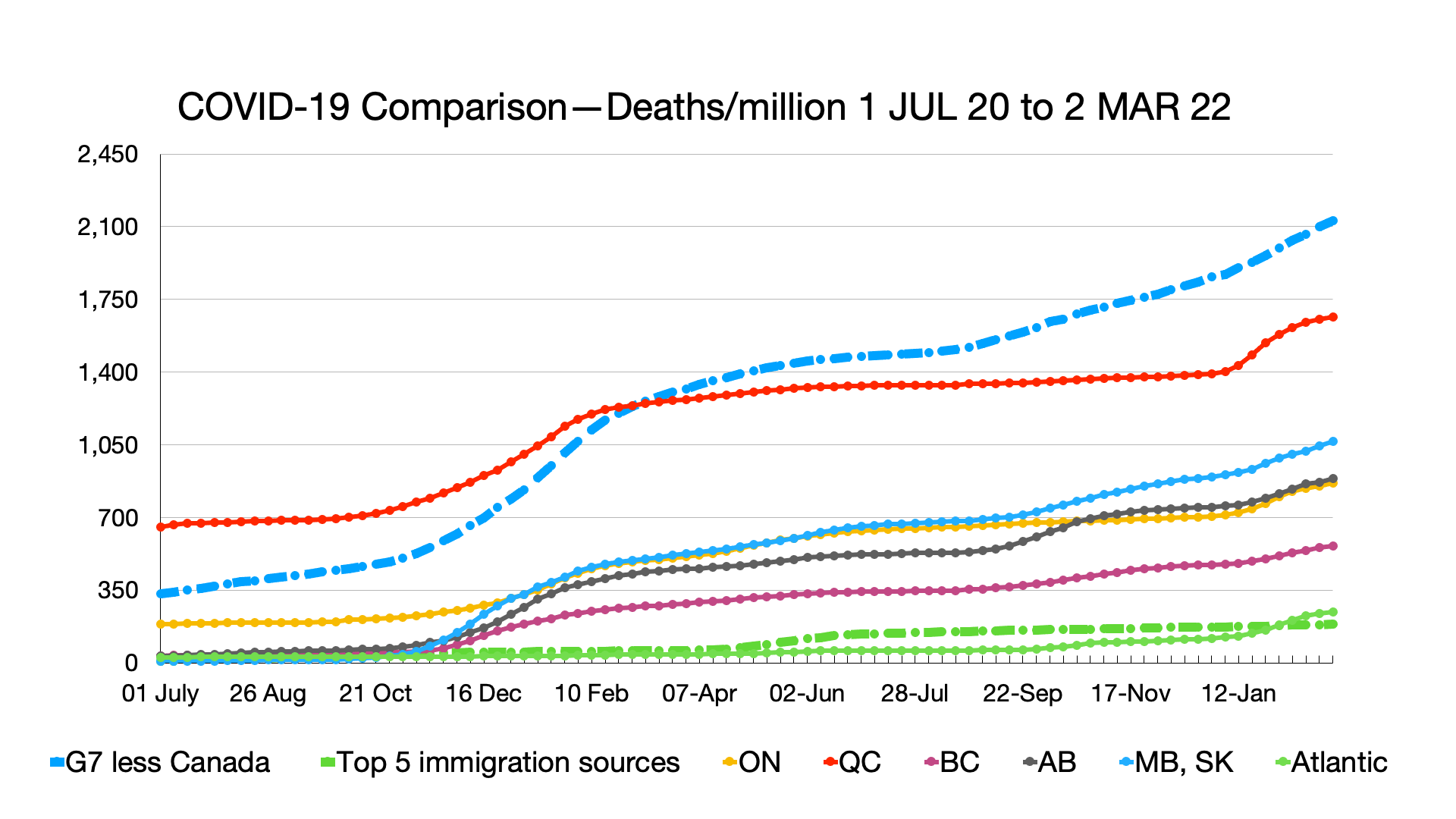
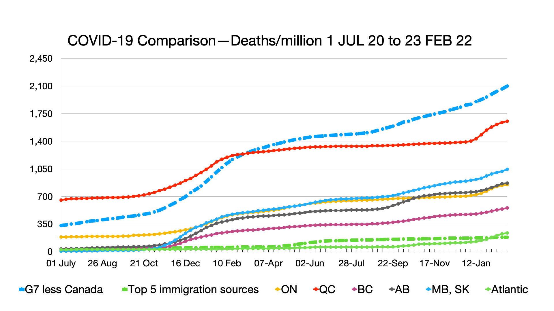
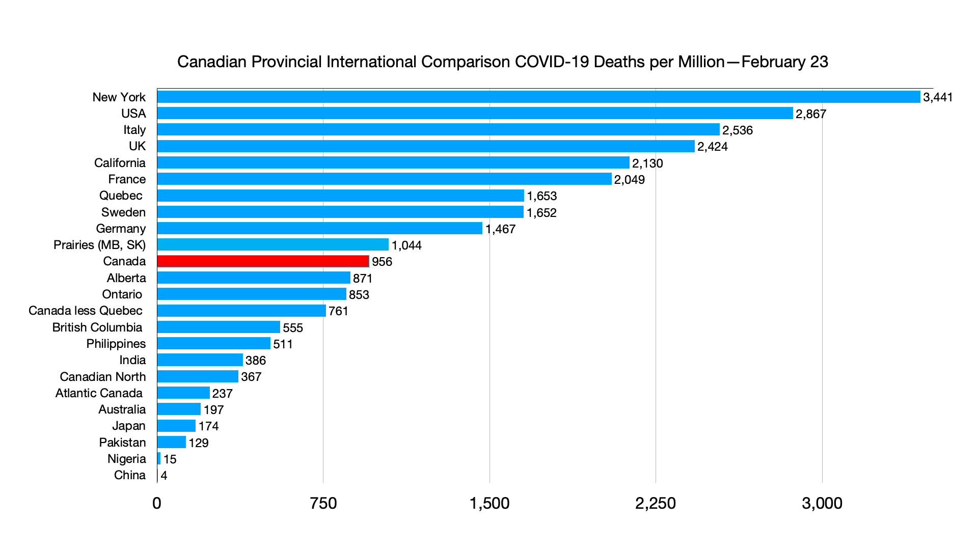
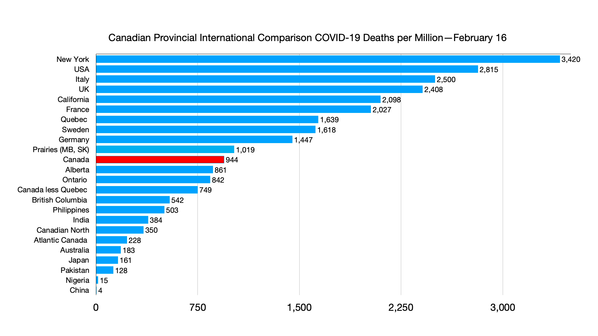
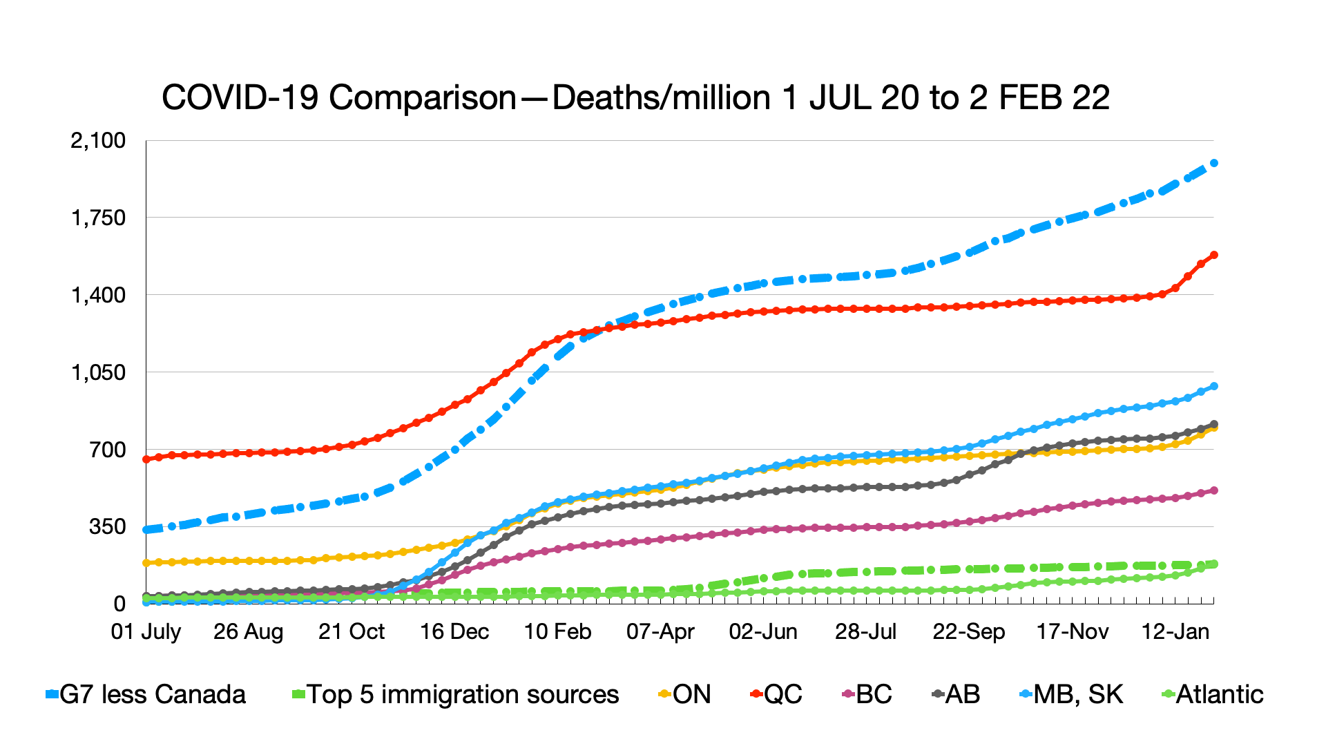
Deaths: G7 still not plateauing.

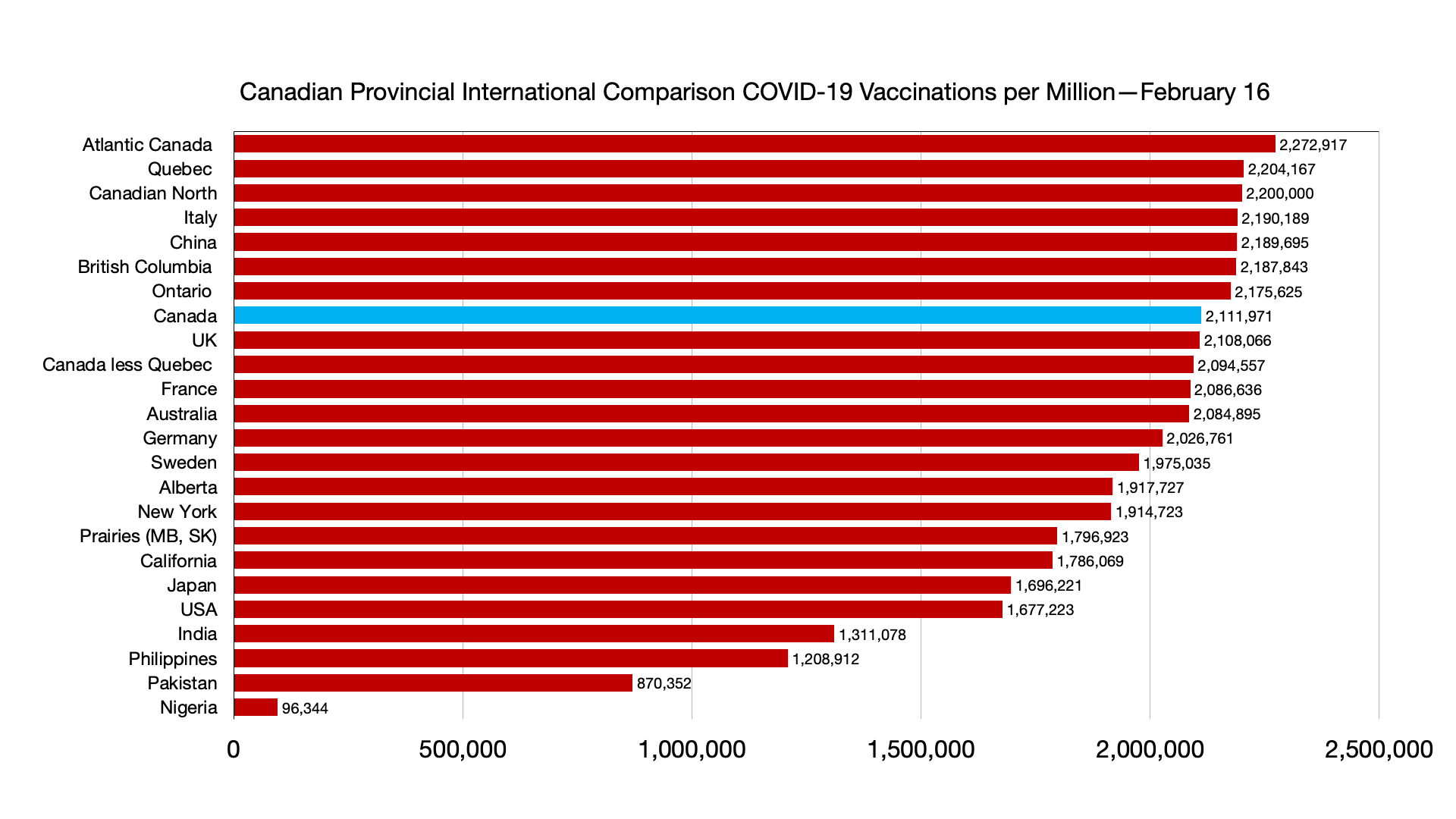
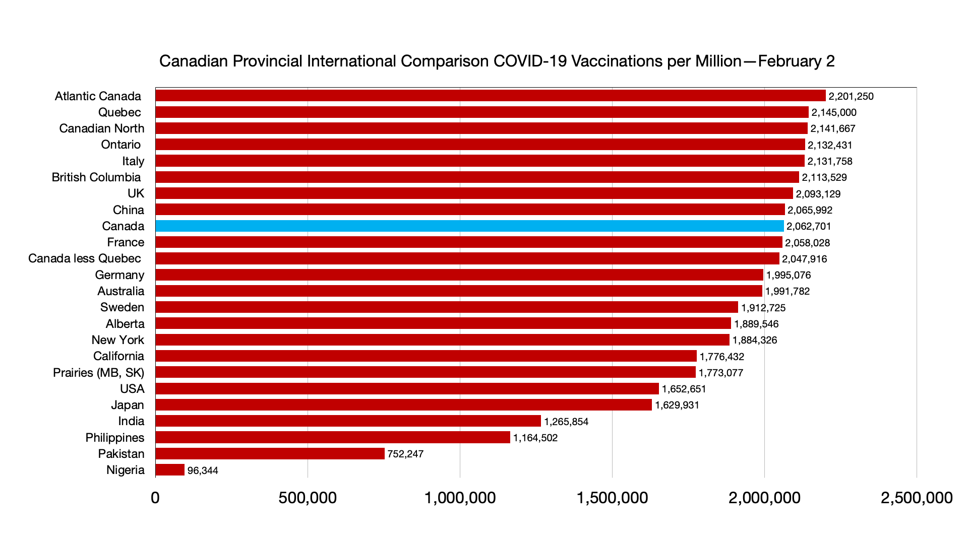
Vaccinations: No major relative changes although Japan is now ahead of California.
Weekly
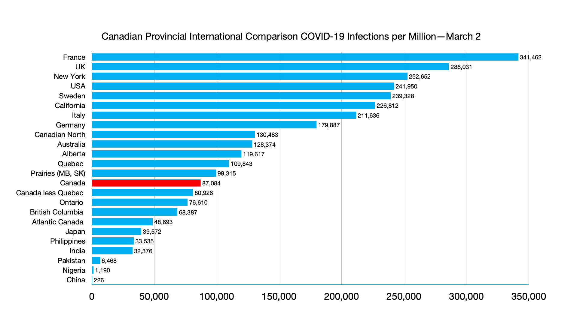
Infections: No relative changes. Infections per million in China have increased from 226 per million to 436 per million.

Deaths: Major change again is with respect to China with deaths per million increasing from 3.9 to 5 per million.

New Zealand changes its tack on surging COVID-19 cases
Back in August, New Zealand’s government put the entire nation on lockdown after a single community case of the coronavirus was detected.
On Tuesday, when new daily cases hit a record of nearly 24,000, officials told hospital workers they could help out on understaffed COVID-19 wards even if they were mildly sick themselves.
It was the latest sign of just how radically New Zealand’s approach to the virus has shifted, moving from elimination to suppression and now to something approaching acceptance as the omicron variant has taken hold.
Experts say New Zealand’s sometimes counterintuitive actions have likely saved thousands of lives by allowing the nation to mostly avoid earlier, more deadly variants and buying time to get people vaccinated. The nation of 5 million has reported just 65 virus deaths since the pandemic began.
But virus hospitalizations have been rapidly rising, hitting a record of more than 750 on Tuesday and putting strain on the system.
Across the country, the explosion in cases has left people stunned. Just a month ago, case numbers were around 200 per day. Now, the outbreak is affecting everyone from frontline workers to lawmakers.
Opposition Leader Christopher Luxon became the highest profile politician yet to announce he was infected on Monday, saying he felt fine and would continue working from home.
One factor that hastened the outbreak was the return of thousands of university students to campuses around the country last month.
Ralph Zambrano, the student president at Victoria University of Wellington, said the virus had spread rapidly through hundreds of students in residence halls, taking a toll on their mental health and well-being.
“The campus would usually be buzzing at this time of year but it has a very eerie feeling to it,” he said, adding that most students were opting to learn remotely. “There’s lots of anxiety and tension.”
He said the outbreak had strained the food supply system in the halls, with some students being offered only a protein drink for breakfast or a piece of cold meat and some peas for dinner.
The university said case numbers in the halls were now reducing as students recovered.
Professor Michael Baker, an epidemiologist at the University of Otago, said the variant had proved as ferociously infectious in New Zealand as it had in other countries.
He said cases appeared to be plateauing or even starting to dip in the largest city of Auckland, while still rising elsewhere.
While much of the world was breathing a sigh of relief after two years of terrible problems, Baker said, New Zealand was at its worst point yet in the pandemic and was coming to terms with the fact the virus would remain in the country permanently.
He said he was concerned health authorities had lost the ability to properly track the outbreak, as they struggled to shift from a system where they carefully monitored a few cases to dealing with thousands of self-reported results from rapid antigen tests.
Dr. Caroline McElnay, the director of public health at the Ministry of Health, told reporters the number of hospitalizations would grow, but that patients with omicron generally had less severe illnesses than previous patients had experienced with the delta variant.
She said the rising number of both patients and infected health workers had prompted the relaxation in the rules around when health workers could return to hospitals.
She said infected workers would only be allowed to work with patients who already had the virus, and if there were no other options.
“It’s an extra tool that enables our health system to keep running,” she said.
Source: New Zealand changes its tack on surging COVID-19 cases